Project Details
Client
Rotaract Iași Copou
Country
Romania
Services
Logo Design, Brand Strategy
Duration
2 months
PROJECT OVERVIEW
ClarObscur is more than an art exhibition. It is a meeting point between art and medicine, light and darkness: a sensory experience that invites the public to step into the inner world of people who see life differently. Artists paint live while guests enjoy a wine tasting, and the event has a double purpose: to raise awareness of eye health problems and to help people with low vision. I created the event's logo and brand strategy for this Rotaract Iași Copou project.
challenges
ClarObscur already had a strong concept, but its design did not do it justice. The existing visual identity was outdated and inconsistent, with no single element the audience could recognize or remember. For an event that depends on curiosity and word of mouth, this was a real problem: people could not easily tell what ClarObscur was, or connect its pieces into one story.
The second challenge was the concept itself. The event combines art, medicine, a wine tasting and a charity cause, and the identity had to hold all of them together without feeling confusing or heavy. It also had to speak to several groups at once: art lovers, potential partners and donors, and people who care about eye health. And because the theme is sight, the brand needed to be thoughtful about how it plays with light and shadow.
solutions
I started with brand strategy, defining what ClarObscur stands for and how it should speak. The tension in the name, light against darkness, became the creative foundation: one idea that could hold together art, medicine, the wine tasting and the charity cause without any of them competing for attention.
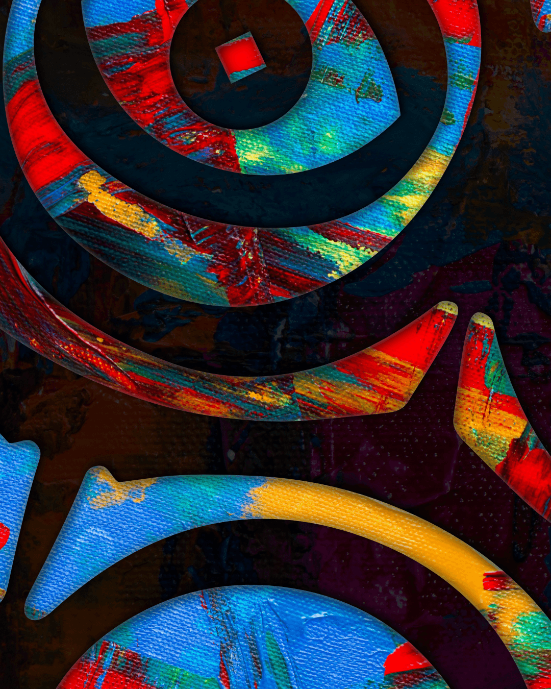
The logo turns that idea into a single, memorable symbol. The monogram is built from concentric "C" shapes that spiral inward until they form an eye, so the initials of the event and the theme of sight become one image. The eye sits in the centre like a point of focus, which invites the audience to look closer, just as the event invites them to see the world through other people's eyes. The sharp contrast between black shapes and white space is the "clar" and "obscur" of the name made visible, and it also gives the mark a graphic strength that holds up on posters, social media and printed materials.
The wordmark balances that intensity with warmth. A bold serif with soft, slightly flared forms feels cultural and artful, close to the world of galleries and exhibitions, while staying friendly and readable. Together, the symbol and the type give ClarObscur a recognizable face where there was none before. Because the logo works in solid black and white, it adapts easily to light and dark backgrounds, which fits the theme and makes it easy to apply consistently across partners' materials and social channels.
Giving light and shadow a face people remember and want to support. One contrast, one identity, one cause.
impact
With a coherent identity and a clear story, ClarObscur went from an event with a good idea to one that attracted partners, participants and real support for its cause. The new brand made it easier to explain, share and back the event, and the results show it.
5,000+
EUR in donations
10+
partners on board
70+
participants
20k+
social media engagements